
响应式 Hero 区域设计:文字与图片的完美适配
前言
Hero 区域是网站的第一印象,承载着品牌展示和用户引导的重要使命。在响应式设计中,Hero 区域需要根据不同设备的屏幕尺寸和用户习惯进行精细调整。本文将深入分析我博客项目中 Hero 区域的响应式设计策略,展示如何实现文字大小、图片尺寸和整体布局的完美适配。
项目背景
我的博客 Hero 区域采用了文字+图片的经典布局,包含博客介绍、标语和图片。在不同设备上,这些元素需要以不同的比例和尺寸呈现,确保最佳的视觉效果和用户体验。
核心设计策略
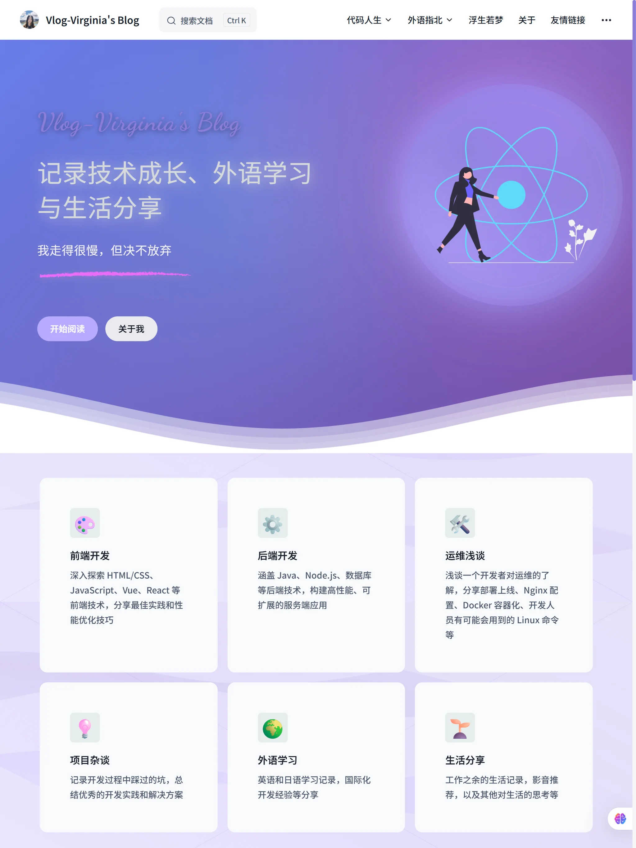
1. 大屏幕设备:沉浸式体验
对于大屏幕设备(961px - 1200px),我们采用宽屏布局,充分利用屏幕空间:
css
/* 大屏幕断点 (1200px以下) */
@media (max-width: 1200px) {
  .VPHero {
    padding-top: 100px !important;
    padding-bottom: 180px !important;
    padding-left: 60px !important;
    margin-top: 0 !important;
  }

  .VPHero .text {
    font-size: 2.5rem;
    width: 460px;
  }

  .VPHero .image .image-container {
    width: 300px !important;
    height: 300px !important;
  }
}设计特点:
- 较大的内边距,营造宽敞感
- 文字尺寸适中,确保可读性
- 图片尺寸合理,与文字比例协调
- 左侧布局,符合阅读习惯
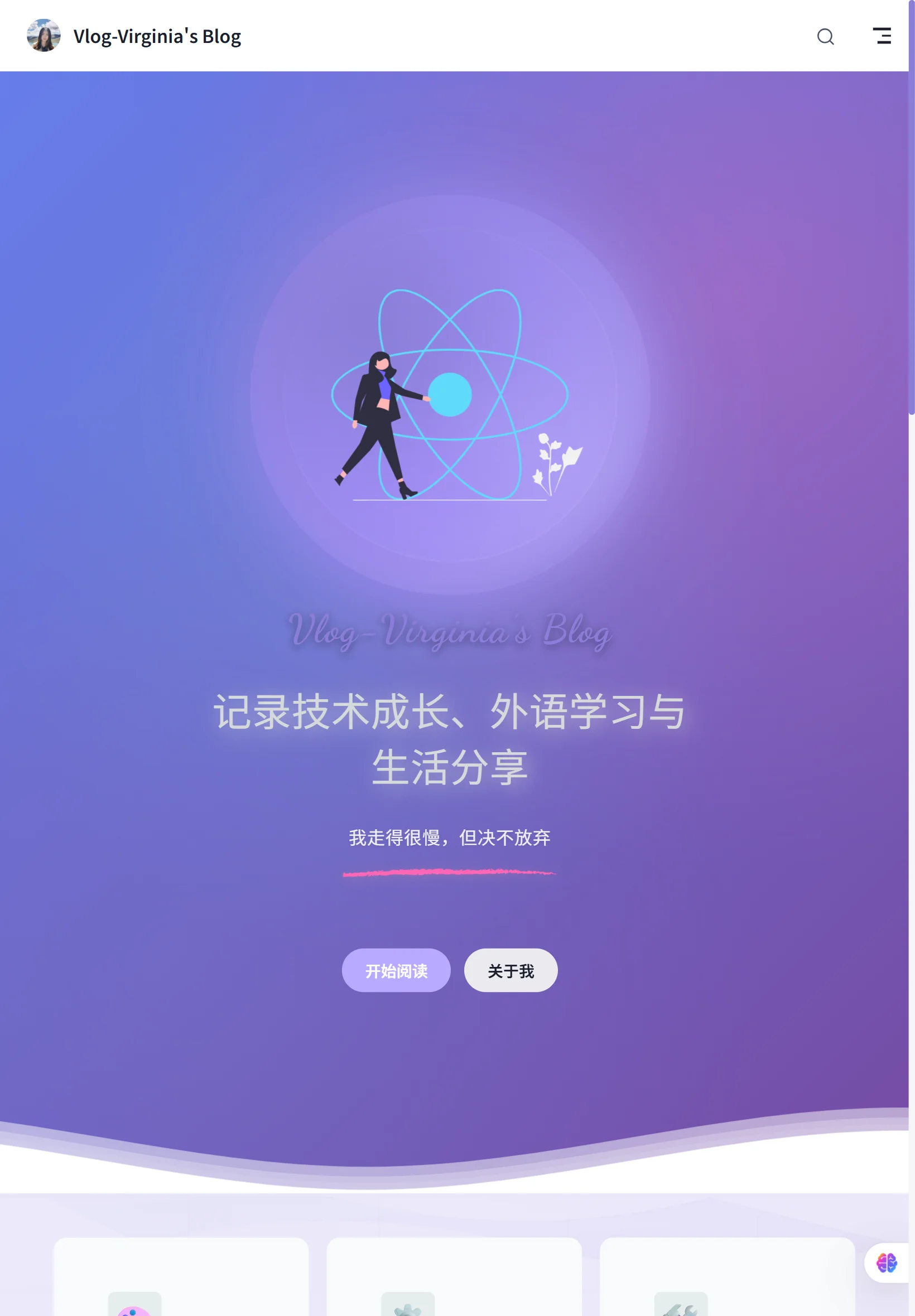
2. 中等屏幕设备:平衡布局
对于中等屏幕设备(960px 以下),我们开始调整布局比例:
css
/* 中等屏幕断点 (960px以下) */
@media (max-width: 960px) {
  .VPHero {
    padding-left: 40px !important;
  }

  .VPHero .container {
    padding: 0 20px !important;
  }

  .VPHero .name {
    font-size: 2.2rem !important;
    text-align: center !important;
    margin-top: 80px !important;
  }

  .VPHero .text {
    font-size: 2.2rem !important;
    text-align: center !important;
  }

  .VPHero .tagline {
    font-size: 1rem !important;
    text-align: center !important;
  }

  /* 修复彩虹条位置 */
  .VPHero .tagline::after {
    width: 200px !important;
    height: 10px !important;
    margin: 15px auto 0 !important;
    background-size: contain !important;
  }

  .VPHero .image {
    display: flex !important;
    justify-content: center !important;
    margin-top: 40px !important;
  }

  .VPHero .image .image-container {
    transform: translate(0, 0) !important;
    width: 300px !important;
    height: 300px !important;
    margin: 0 auto !important;
  }
}设计思路:
- 文字居中对齐,适应中等屏幕
- 图片居中显示,与文字形成视觉平衡
- 彩虹条装饰元素自适应调整
- 保持整体视觉和谐
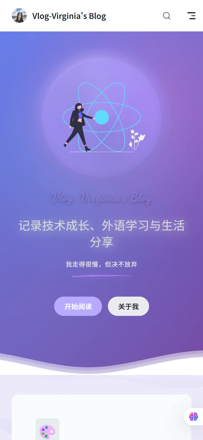
3. 移动端设备:垂直布局
对于移动端设备(768px 以下),我们切换到垂直布局:
css
/* 小屏幕断点 (768px以下) */
@media (max-width: 768px) {
  .VPHero {
    padding-top: 80px !important;
    padding-bottom: 150px !important;
    padding-left: 30px !important;
    margin-top: 0 !important;
  }

  .VPHero .container {
    padding: 0 15px !important;
    max-width: 100% !important;
  }

  .VPHero .name {
    font-size: 1.8rem !important;
    margin-bottom: 25px !important;
    margin-top: 80px !important;
  }

  .VPHero .text {
    font-size: 1.8rem !important;
    margin-bottom: 15px !important;
  }

  .VPHero .tagline {
    font-size: 0.9rem !important;
    margin-bottom: 20px !important;
    line-height: 1.6 !important;
  }

  /* 移动端彩条装饰效果 */
  .VPHero .tagline::after {
    width: 150px !important;
    height: 8px !important;
    margin: 12px auto 0 !important;
  }

  .VPHero .image {
    margin-top: 30px !important;
  }

  .VPHero .image .image-container {
    width: 280px !important;
    height: 280px !important;
  }

  /* 移动端呼吸灯外层光环 */
  .VPHero .image .image-container::before {
    top: -15px !important;
    left: -15px !important;
    right: -15px !important;
    bottom: -15px !important;
    filter: blur(15px) !important;
  }

  /* 移动端呼吸灯内层光晕 */
  .VPHero .image .image-container::after {
    top: -8px !important;
    left: -8px !important;
    right: -8px !important;
    bottom: -8px !important;
  }
}设计特点:
- 垂直布局,符合移动端阅读习惯
- 文字尺寸适当缩小,确保可读性
- 图片尺寸调整,适应小屏幕
- 装饰效果简化,提升性能
4. 超小屏幕优化
对于超小屏幕设备(480px 以下),进一步优化显示效果:
css
/* 超小屏幕断点 (480px以下) */
@media (max-width: 480px) {
  .VPHero {
    padding-top: 30px !important;
    padding-bottom: 120px !important;
    padding-left: 24px !important;
    margin-top: 0 !important;
  }

  .VPHero .container {
    padding: 0 10px !important;
  }

  .VPHero .name {
    font-size: 1.5rem !important;
    margin-bottom: 20px !important;
    margin-top: 70px !important;
  }

  .VPHero .text {
    font-size: 1.5rem !important;
    width: fit-content;
    margin-bottom: 12px !important;
  }

  .VPHero .tagline {
    font-size: 0.8rem !important;
    margin-bottom: 15px !important;
  }

  .VPHero .tagline::after {
    width: 120px !important;
    height: 6px !important;
    margin: 10px auto 0 !important;
  }

  .VPHero .image {
    margin-top: 25px !important;
  }

  .VPHero .image .image-container {
    width: 240px !important;
    height: 240px !important;
  }

  .VPHero .image .image-container::before {
    top: -12px !important;
    left: -12px !important;
    right: -12px !important;
    bottom: -12px !important;
    filter: blur(12px) !important;
  }

  .VPHero .image .image-container::after {
    top: -6px !important;
    left: -6px !important;
    right: -6px !important;
    bottom: -6px !important;
  }
}设计特点:
- 垂直布局,符合移动端阅读习惯
- 文字尺寸适当缩小,确保可读性
- 图片尺寸调整,适应小屏幕
- 装饰效果简化,提升性能
技术实现细节
1. 基础样式设置
css
/* Hero区域基础样式 */
.VPHero {
  padding-top: 75px !important;
  padding-bottom: 180px !important;
  padding-left: 100px !important;
  position: relative;
  background: linear-gradient(135deg, #667eea 0%, #764ba2 100%);
  margin-bottom: 0;
  margin-top: 0 !important;
  width: 100% !important;
  max-width: 100% !important;
  overflow-x: hidden !important;
  box-sizing: border-box !important;
}

/* 文字样式 */
.VPHero .name {
  color: #78797a;
  text-shadow: 0 2px 8px rgba(0, 0, 0, 0.4);
  font-weight: 700;
  font-family: "Dancing Script", cursive;
  font-size: 2.5rem;
  letter-spacing: 1px;
  margin-bottom: 20px !important;
}

.VPHero .text {
  color: #d6d9db;
  font-size: 3rem;
  line-height: 1.4;
  font-family: "Noto Sans SC", -apple-system, BlinkMacSystemFont, "Segoe UI", Roboto,
    sans-serif;
  font-weight: 400;
  letter-spacing: 0.3px;
  text-shadow: 3px 3px 20px rgb(216 215 215 / 80%);
  margin-bottom: 15px !important;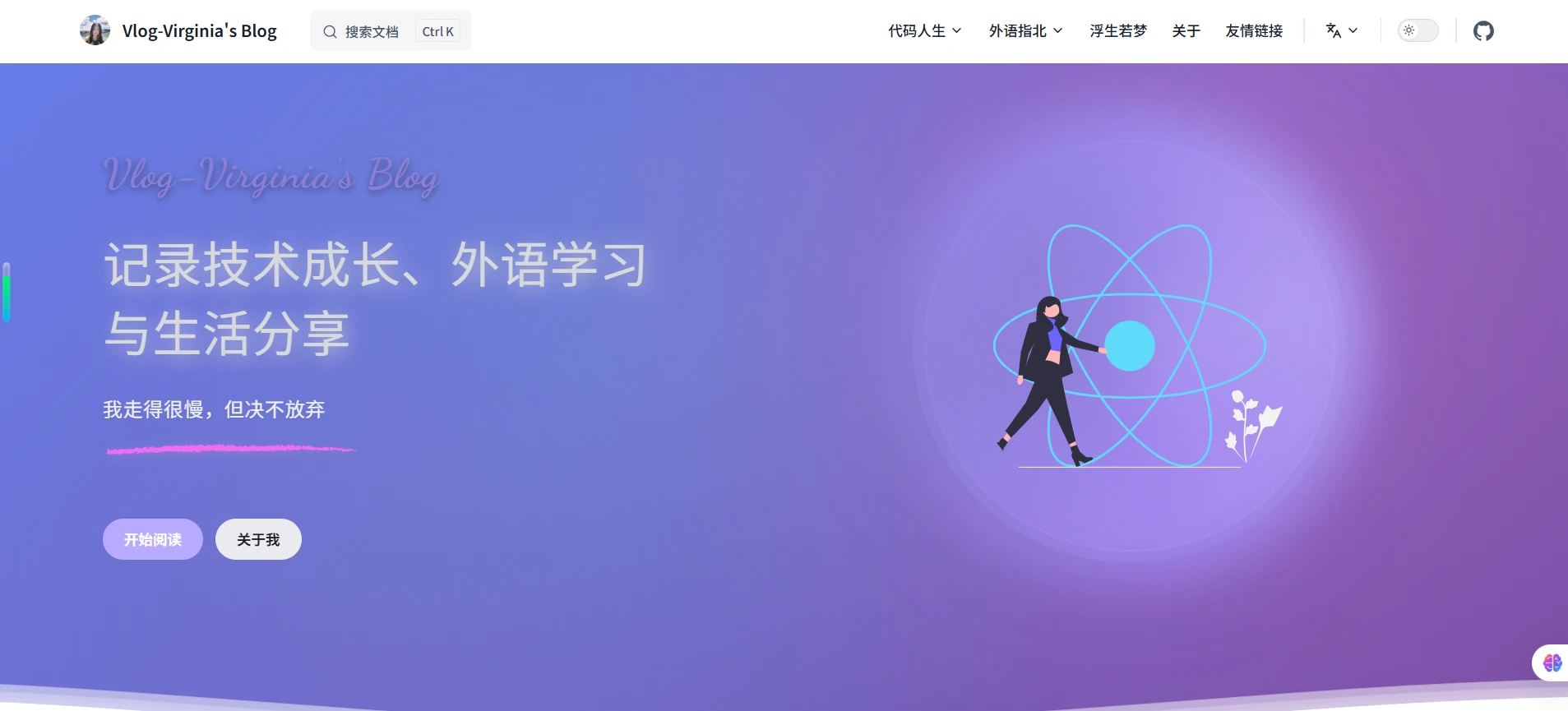
}设计特点:
- 整体布局效果:创建了一个具有现代感渐变背景的页面头部
- 文字视觉效果:主标题使用 Dancing Script 手写字体,营造优雅的视觉风格;通过文字阴影和颜色搭配,增强文字的层次感和立体感
2. 图片容器样式
css
/* Hero图片容器样式 */
.VPHero .image .image-container {
  transform: translate(20px, 0px);
  transition: transform 0.3s ease;
  cursor: pointer;
  border-radius: 50%;
  overflow: visible;
  box-shadow: 0 8px 32px rgba(0, 0, 0, 0.15), 0 0 60px rgba(139, 126, 216, 0.3),
    0 0 120px rgba(157, 141, 241, 0.2), 0 0 180px rgba(184, 169, 255, 0.1);
  background: linear-gradient(
    135deg,
    rgba(255, 255, 255, 0.05),
    rgba(255, 255, 255, 0.02)
  );
  backdrop-filter: blur(10px);
  border: 2px solid rgba(255, 255, 255, 0.15);
  width: 400px;
  height: 400px;
  display: flex;
  align-items: center;
  justify-content: center;
  position: relative;
  animation: breathing-light 3s ease-in-out infinite;
}设计特点:
- 图片容器样式:图片容器使用了呼吸灯效果,营造现代感;通过阴影和渐变背景,增强图片的立体感和层次感;通过动画效果,增强图片的动态感和活力感
3. 装饰效果适配
css
/* 彩条装饰效果 */
.VPHero .tagline::after {
  content: "";
  display: block;
  width: calc(100% - 0.7em);
  height: 11px;
  margin: 1em 0 0 0.2em;
  background-image: url("/images/rainbow-bar.svg");
  background-repeat: no-repeat;
  background-size: contain;
  background-position: left center;
  position: relative;
  z-index: 1;
  animation: colorShift 4s ease-in-out infinite;
  filter: drop-shadow(0 2px 4px rgba(139, 126, 216, 0.3));
}css
/* 彩条颜色变换动画 */
@keyframes colorShift {
  0%,
  100% {
    filter: drop-shadow(0 2px 4px rgba(139, 126, 216, 0.3)) hue-rotate(0deg);
  }
  25% {
    filter: drop-shadow(0 2px 4px rgba(157, 141, 241, 0.3)) hue-rotate(45deg);
  }
  50% {
    filter: drop-shadow(0 2px 4px rgba(184, 169, 255, 0.3)) hue-rotate(90deg);
  }
  75% {
    filter: drop-shadow(0 2px 4px rgba(167, 139, 250, 0.3)) hue-rotate(135deg);
  }
}设计特点:
- 彩虹条装饰效果:在 tagline(我走得很慢,但决不放弃)下方添加变色彩虹条装饰效果,增强视觉效果
- 彩虹条的变色动画原理请见后续文章拆解
用户体验优化
1. 文字可读性
- 字体大小:根据屏幕尺寸调整,确保可读性
- 行高:移动端适当增加行高,提升阅读体验
- 文字阴影:增强对比度,确保在不同背景下都清晰可见
2. 图片展示
- 尺寸适配:根据屏幕大小调整图片尺寸
- 装饰效果:移动端简化装饰效果,提升性能
- 交互反馈:保持悬停和点击效果
3. 布局优化
- 垂直间距:根据屏幕高度调整内边距
- 水平对齐:移动端居中对齐,桌面端左对齐
- 响应式容器:确保内容不会溢出屏幕
实际效果对比
桌面端效果
- 宽屏布局,充分利用空间
- 文字和图片比例协调
- 装饰效果丰富,视觉冲击力强
平板端效果
- 居中对齐,视觉平衡
- 文字尺寸适中,易于阅读
- 图片居中显示,与文字呼应
移动端效果
- 垂直布局,符合阅读习惯
- 文字紧凑,信息密度高
- 图片尺寸合理,不占用过多空间
最佳实践总结
1. 断点设计原则
- 1200px:大屏幕与中等屏幕的分界线
- 960px:中等屏幕与移动端的分界线
- 768px:移动端优化的起点
- 480px:超小屏幕的特殊处理
2. 文字适配策略
- 大屏幕:较大字号,营造震撼感
- 中等屏幕:适中字号,保持可读性
- 移动端:紧凑字号,提高信息密度
3. 图片适配策略
- 大屏幕:大尺寸,突出视觉效果
- 中等屏幕:中等尺寸,与文字平衡
- 移动端:小尺寸,节省空间
结语
响应式 Hero 区域设计需要在视觉效果和用户体验之间找到完美平衡。通过合理的断点设计和精细的样式调整,我们可以为不同设备提供最适合的 Hero 体验。关键是要理解用户在不同设备上的使用习惯和视觉期望,并据此调整布局和样式。
在实际项目中,建议通过 A/B 测试来验证不同设计方案的效果,并根据用户反馈持续优化设计策略。